Photo: Little Windows Photography
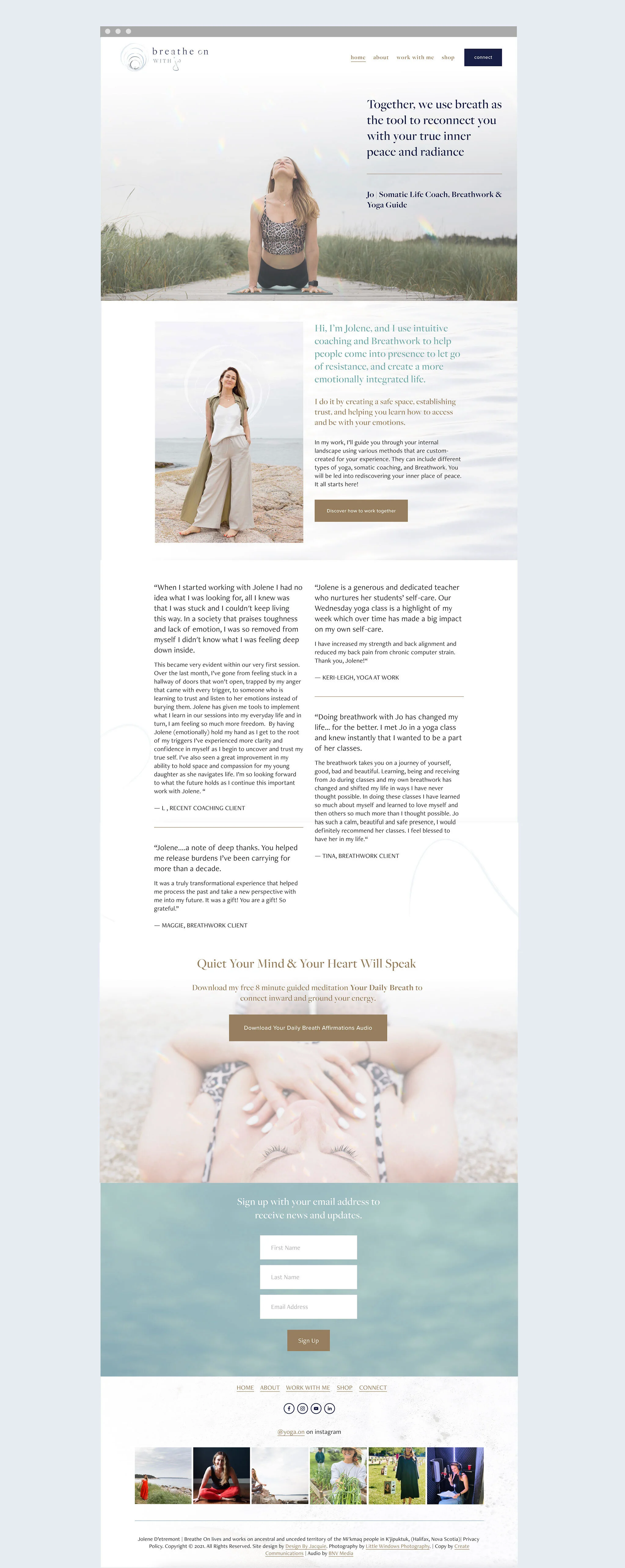
Jo was ready for an entirely new brand, site, and vision to put forward with her healing work.
We worked together on renaming her business for renewed clarity. We explored what type of symbols would best represent her for a new logo. We landed on using the symbol of the koshas, which was derived from Jo’s expertise in yoga and teaching. The koshas symbol represents not only layers of the energetic body that surrounds the soul but serves as a representation of the continuous circle, and power, of breath which is at the core of Jo’s work.
It was important to represent the powerful transformations that occur when doing breathwork, or through yoga and coaching. Adding in the reflection of rainbow prism light over featured photos added a heightened level of vibrancy and magic to portraying the healing experience.
For her website re-design, it was a priority to make it clean, clear, and easy to navigate her new revised services.


